
This isn’t so much a workshop as an information portal on colour. There have been millions of words written about colour theory, some fascinating and some bamboozling. I want to show you what I have found helpful so far in the hope that it will help you too.
A FEW FUNDAMENTALS:
When we talk about colour, we are talking about 3 things:
The HUE: this is the simple name we give to a colour – red, blue, green – but of course not all reds are equal.
The INTENSITY: this is the strength and vividness of a colour
And the VALUE: this is the lightness or darkness of a colour. For example, pink is a light version of red.
A TINT of a colour is a colour plus white; a SHADE of a colour is a colour plus black.
Getting the hang of these in a practical context is enormously helpful.
Here are a few colour wheels I have found useful:
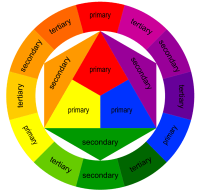
Colour Wheel
This first one is one of the more basic colour wheels which helps beginners get the hang of complementary colours (colours opposite each other on the colour wheel) and other colour schemes such as analagous, triadic, split complementaries, rectangle and square.
Image Source: http://www.artyfactory.com/color_theory/color_theory_terms_1.htm
(For more info on these colour schemes: http://www.tigercolor.com/color-lab/color-theory/color-harmonies.htm)

Warm/Cool colours
This colour wheel is useful when trying to figure out which colours are cool and which are warm.
IMAGE SOURCE: http://www.tigercolor.com/color-lab/color-theory/color-theory-intro.htm
The website in this link is also a good summary of basic colour theory: http://www.tigercolor.com/color-lab/color-theory/color-theory-intro.htm

The Colour Bias Wheel
IMAGE SOURCE: http://schoolofcolour.com/index.php?option=com_content&view=article&id=80&Itemid=767&lang=en
I found this colour wheel in the book “Blue and Yellow Don’t Make Green” by Michael Wilcox. Right from the snazzy title, this book changed the way I think about colour, so I will spend a little time talking about the author’s approach.
Colour is one of the areas where art and science converge and Wilcox wants us to think of the science when learning about colour mixing. Think back to your primary school experiments of passing light through a prism and seeing all the colours of light appear… now:
In extraordinarily simple terms (as I am no scientist), my understanding is that the colours that we see are the light wavelengths (what I am calling “colour waves”) that are reflected, and not absorbed by, an object. Objects or surfaces that absorb all the colour waves well, will reflect very little and appear black. An object with what we recognise as a white surface will reflect almost all of the colour waves and therefore appear white. A yellow object will absorb almost all of the colour waves except yellow, which is reflected – and so on.
Wilcox then goes on to describe colour mixing as predicting which combination of colour waves will be reflected and which absorbed. I find it a little difficult to remember the science of it when trying to paint, so I have simplified it to make it useful for myself in my studio.
PREDICTING RESULTANT COLOUR MIXES
Wilcox names the basic colours in such a way that it eliminates a lot of the guesswork that beginners experience when mixing colours. In his colour wheel, he also shows how much of each hue is present in each colour.
How do you mix orange? Red and yellow you say? Think about it this way:
An orange-red (warm red) plus an orange-yellow (warm yellow) will result in a very bright orange, as both the colours reflect a lot of orange
Orange-red (warm red) plus green-yellow (cool yellow) will result in a mid orange as only one of the colours reflects orange
Green-yellow (cool yellow) and violet red (cool red) result in a dull orange as neither colour reflects orange well.
(I have added the “cool” and “warm” terms as I find them easier to remember)
I have compiled a table of the colours recommended by Wilcox – you can get away with only buying 6 tubes of paint. Awesome!
| COLOURS – minimum | COMMERCIAL NAME | OPACITY |
| Orange-Red (warm red) | Cadmium red light PR108 | Opaque |
| Violet-Red (cool red) | Quinacridone Violet PV 19 | Transparent |
| Orange-Yellow (warm yellow) | Cadmium Yellow Light PY35 | Opaque |
| Green-Yellow (cool yellow) | Hansa Yellow Light/Lemon Yellow PY3 | Semi-transparent |
| Green-Blue (cool blue) | Cerulean Blue PB36:1 | Opaque |
| Violet-Blue (warm blue) | Ultramarine Blue PB29 | Semi-transparent to transparent |
| COLOURS – optional | ||
| Mid Green | Pthalo Green PG7 | Transparent |
| Green-blue | Pthalo Blue PB15 | Transparent |
| Neutralised orange | Burnt Sienna PBR7 | Transparent |
| Neutralised orange-yellow | Yellow Ochre PY43 | Semi Opaque |
| Neutralised Orange-yellow | Raw Sienna PBR7 | Semi Transparent to transparent |
PREDICTING OPACITY
Paying attention to the opacity of the paints you are mixing will help you predict the opacity of the resultant mix. This is very useful in painting – you may need a transparent colour for a glaze or wash; you may need an opaque one for some impasto work or to cover up any errors.
Again, in simple terms:
- Mixing two transparent colours will result in very transparent mixes.
- When mixing opaque and transparent colours, the resultant mix will be:
more transparent if more transparent colour is used in the mix; and
more opaque if more opaque colour is used in the mix
A QUICK NOTE ABOUT WARM & COOL COLOURS
The most important thing to remember here is that cool colours recede and warm colours advance. So if you want to make the top half of your canvas look like it is distant, use a cool colour. If you want something to jump out at you, use a warm colour.
This is particularly useful in landscapes but also in portraiture. When describing the form of the face, there will be some areas which you want to turn away from the viewer, into the canvas. You can use cooler colours in these areas. A simple example is the head which will appear more three dimensional and rounded if the edges are moving away from the viewer.
HOW COLOURS INTERACT WITH EACH OTHER ON THE CANVAS
Colours in art are rarely in isolation. I find the ways that colours influence each other to be facsinating. I am, perhaps, alone in that view.
A few examples:
- A colour may seem warmer or cooler when contrasted with other colours: eg a warm hue surrounded by a warmer hue will seem cooler
- A colour may shift to the complement of a neighbouring colour (see simultaneous contrast below)
- When complementary colours of the same value are juxtaposed they seem to vibrate or have more energy; the enhance each other and enhance the intensity of each other.
- Optical mixing: the eye will mix small areas of colour which are close together. This is very evident in impressionism and divisionism. For this to work effectively, equal values of hues need to be used.
Colours in composition
A book recommended by most art teachers which looks at colour in composition is “The Art of Colour” by Johannes Itten. This is not an easy read, but I found his examination of different types of contrast to be useful. Contrasts are a compositional device and will add interest to your painting. I have tried to distil his dense prose here for you.
CONTRAST OF HUE:
- Using different combinations of colours will have different effects depending on their distance from each other on the colour wheel. The use of primary colours is the most extreme contrast of hue with a vigorous and intense result.
- The intensity of contrast of hue decreases as the hues move away from the primaries. As can be seen in the examples below, the combination of orange, green and violet will be weaker in character than the combination of red, yellow and blue.
- Contrast of hue is stronger the further away one hue is from another on the colour wheel
- When colours are separated by a white or black line, their individual characters are stronger as they don’t influence each other (see simultaneous contrast below)

Contrast of hue
IMAGE SOURCE:

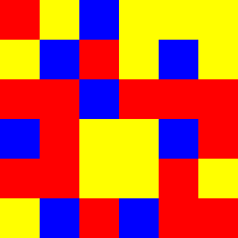
Contrast of hues: Primaries
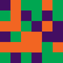
Contrast of hues: secondaries
Source of Images: http://faculty.weber.edu/sjbetz/teachingfolder/design2dfolder/webpagesfolder/desass4exitten.html
LIGHT-DARK CONTRAST
- This is the use of two colours with different intensities.
- The strongest light-dark contrast will be yellow and violet, as yellow is the lightest hue and violet is the darkest
- Compositions relying mostly on light-dark contrast tend to use a small number of hues

Light-Dark contrast

COLD-WARM CONTRAST
As mentioned above, this is most useful in indicating nearness and distance.
I have used cold-warm contrast in this picture to ensure the flowers “come forward”and are the centre of attention.

Cold-Warm Contrast

In this picture, I have used mostly warm colours in the foreground and cool colours in the background.
COMPLEMENTARY CONTRAST.
I use complementary contrast most often in my paintings. I will frequently use complementary colours and graduated mixtures of them.
Eureka Moment: when I realised that complementary colours didn’t have to be vivid versions of the hue – the standard red and green complement can actually be pink and green, or magenta and turquoise; the blue/orange complement can be blue and burnt sienna. Handy!

Yellow & Violent complementaries
SIMULTANEOUS CONTRAST
This is a bit complicated… a simple example is, if grey is next to another colour, then the grey will shift towards the complement of the colour. So if grey is next to red, the grey will seem greenish. This can work with any colours that are not complements of each other: so if red is next to blue, the blue will appear to be a green-blue and the red will appear to be an orange-red.

Simultaneous Contrast
Image Source: http://faculty.weber.edu/sjbetz/teachingfolder/design2dfolder/webpagesfolder/desass4exitten.html
CONTRAST OF SATURATION: this is the contrast between pure, intense colours and dull, diluted colours

Contrast of Saturation

Contrast of Saturation
Source of Images: http://faculty.weber.edu/sjbetz/teachingfolder/design2dfolder/webpagesfolder/desass4exitten.html
CONTRAST OF EXTENSION: this is the contrast between much and little/great and small. Eg – a small circle of orange on a large green canvas. A few points about this:
- The minority colour will seem more vivid
- If the colours are not complementary, then the minority colour will be affected by simultaneous contrast
- The examples below are also good examples of complements “vibrating” which I referred to earlier.

Contrast of Extension
Image Source: http://arts.unomaha.edu/art/ART1100/extension.htm
If you find that thinking about colour in an academic way ruins the spontaneity of your creation process, just keep these ideas in the back of your mind, and go with what feels right. You can always step back and analyse your work after the fact to figure our what approach seems to make your paintings “work”.
Happy colouring!
For more information on colour theory terms, see:
http://www.artyfactory.com/color_theory/color_theory_terms_1.htm
http://www.artyfactory.com/color_theory/color_theory_terms_2.htm
Pingback: "Ashley" Week 1: Diary of a Child Portrait PaintingJulia Sattout